
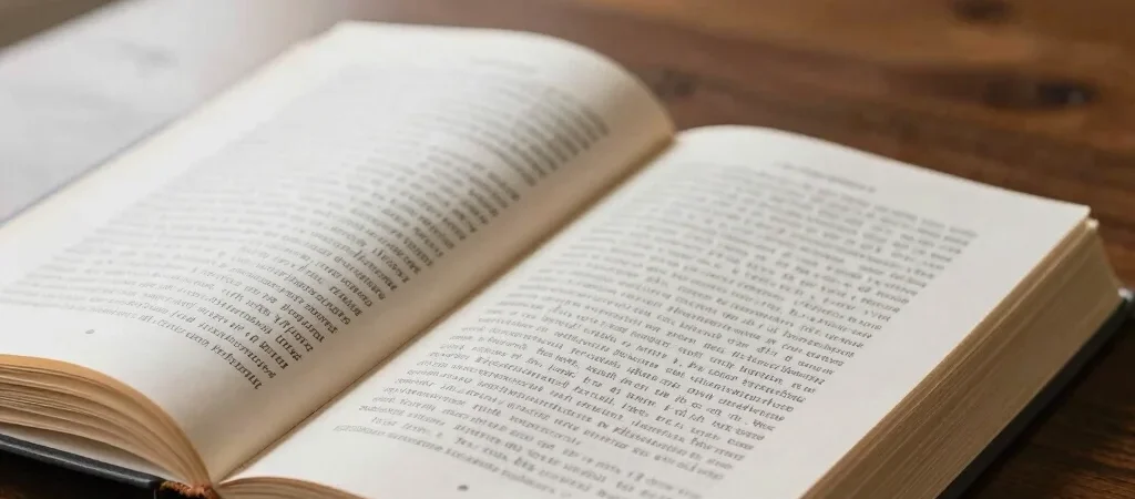
The prediction that digital readers would completely displace bound books has quietly faded into editorial history. Readers continue to seek out physical volumes not from mere nostalgia, but because the tactile medium imposes a unique cognitive pace. Holding a printed volume grounds the mind, offering a physical sanctuary from the continuous interruptions of glowing screens.
The Tactile Weight of Thought
When we hold a bound volume, space and progress become physical realities. The shifting weight of pages from right hand to left provides a silent spatial memory that helps readers anchor narrative arcs and complex arguments. Typography set on cream paper creates a visual rhythm that encourages contemplative focus rather than rapid skimming.
Ink on paper carries an understated permanence that digital formats struggle to replicate. A private library shelf acts as a personal map of intellectual discovery, preserving titles that shaped our thinking over decades.
Designing for Quiet Attention
Publishing thoughtfully in the present era requires honoring the physical medium. Wide margins, carefully chosen serif typefaces, and substantial paper weights are not luxury choices; they are functional elements that respect the reader's attention span. When design steps back and allows prose to breathe, reading becomes an immersive ritual once again.